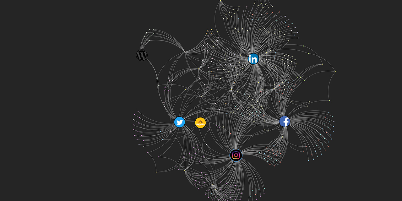
I spent far too much time on this, but I really enjoyed it so I shouldn’t complain. I did some research to see how others have approached this, but I didn’t find anything that was what I was wanting to build. My goal was to visualize total connections through each digital social network and which connection were more interconnected than others, but the side goal was to balance this all against offline social networks. I wanted to get a sense of how my offline communities work into my online communities, and where I might find trends or insights.
Kumu doesn’t have an add-on that allows you to import all of your social media connections, but that’s probably okay because there is far too much nuance and awkwardness between them. A name one might use on Instagram doesn’t always match Twitter, Facebook, etc. Manually adding every person and brand (these are currently hidden, but can be seen if you access the settings > filter area) I am connected with on social media may have been an arduous process, but it gave me a chance to really analyze these networks and to get a better sense of trends. To start, I organized everyone using Kumu’s Element Types field. I defined each person by the community they belong to, whether work, school, family, friends, etc. At times there might be overlap (a co-worker who became a friend), but I went in favour of the initial mode of contact (e.g., Work) rather than the result (e.g., Friend). These networks are represented in the Legend in the bottom-left corner. There needed to be some distinction between my two career paths (design and education) to better understand the story of the visual. For this I added “Design”, “Education”, or “MALAT” to some of my labels to provide that context.
Another element of my mapping process, which might be currently hidden in the map, is that each person (or brand) sits within a sub-context. I may have worked with someone at a design agency, but they could be a designer, coder, project manager, writer, marketer, etc. By adding tags to each connection, I was able to see deeper trends into how I have focused my social network. The tend to follow brands related to beer, coffee, and other food-related themes (e.g., grocery and restaurant). Those connected through Work (Education) could be students, instructors, or a support (e.g., part of the advisory committee). These tags can be activated by clicking the settings button on the right and selected Connect By > Tags. I don’t expect any of you to do this with my map, but I found it quite interesting how connections reside in sub-groupings that often transcend the connection type (e.g., I am connected to coders through both design and education work).
I noticed that I am not very well connected within the Work (Education) area. This is because I worked in the design field for 10 years and in education for only two. Those connections will come with time, and when they do, I hope to ensure they are as diverse and cross-practice as those I have made from my time as a graphic designer. I also noticed that some of these connections came at a time when that social network was taking off. When everyone began using LinkedIn, I added many people from my offline network, but that slowed down over time and those connections are heavily related to a specific time in my life.
If I were to take this to the next level, which I won’t, I would want to visualize the connections between my connections. Using LinkedIn, Instagram and/or Twitter I could find how individuals are connected to others in my network. This would enable me to discover who those key connectors are within my network. To what end? Visual complexity and nothing else.
WordPress is fighting with me and won’t let me add my embed code. You’ll need to use this link to get there. My visual network map


Hi David,
I saw “over-detailed” in your title and thought to myself “Nah, how detailed can it be”
and then saw your network map. I was about to start my own after I looked at yours and now I just don’t feel like doing it at all because i cannot produce something as insanely awesome and detailed as yours.
How much time did it take ?
And you considered taking it to the next level ? I am going to do my own lazy version and just quietly cry in the corner 🙂
Hahaha. Sorry about that, Denys. I didn’t mean to send you to the corner in tears. I’m fascinated by data viz and love the opportunity to explore them when I can. How long did it take? I don’t really know… but I seem to have lost a full day to it. I was probably just trying to avoid doing something else.
Thanks for the reply, keep me updated!