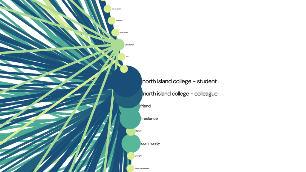
A visual network map is a way of showing relationships between people, groups, or things using a simple node-and-connection format. Each “node” represents an individual or entity, and the lines between them show how they’re connected. This map is a visualization of my LinkedIn connections, helping highlight patterns and clusters that aren’t obvious in a list.
How I made the map
I exported my LinkedIn connections and grouped them by sector. I also tried to export my Facebook connections multiple times, but the exports seem to crash, and I couldn’t problem-solve the issue. I then uploaded my LinkedIn dataset into Gephi Lite to experiment with different visualizations. Because Gephi Lite is serverless, you can’t save projects on their platform. You can download the interactive map, but the MALAT WordPress site doesn’t support that file type—and without cPanel access, I had to find another way to host it.
After some trial and error, I ended up using a GitHub Gist. It worked because it allows Cross-Origin Resource Sharing (CORS), which is needed to display the file. From there, I embedded the map into my blog post using an iframe.
Open the interactive map in a new browser tab to benefit from the full screen width.
What this map reveals
Looking at the map, most of my connections are work-related—which makes sense given that LinkedIn is primarily a professional network. Even though I’ve had a range of freelance clients over the years, most of my connections come from my time at North Island College.
I also realized (as I mentioned in my earlier post, “Curating a Digital Self: An Audit of My Online Presence”) that I haven’t been very active on LinkedIn. A large portion of my network is actually former NIC students, since building a LinkedIn presence is part of their Social Media course.
While the map accurately reflects my LinkedIn connections, it doesn’t feel like a complete picture of my career or the projects I’ve worked on.
I’m hoping that my time in the MALAT program—and whatever comes next—will expand this network in more meaningful ways.
Hi Claire,
You managed to use Gephi! That’s awesome! I gave it a try too, but I’m clearly not as tech-savvy as you.
I had a similar feeling about my map…it didn’t really capture my whole career. I might be a bit more active on LinkedIn than you (at least it looks that way), but there are still lots of professional connections that just don’t show up there.
You did a fantastic job!
Hi Claire,
I really liked your post, and your interactive map actually inspired me to stay up late tonight hacking away at my own blog! I was so impressed by your dynamic setup and went back, got the JavaScript working on my network map. I hosted the file on GitHub Pages, and used a WordPress IFrame plugin to get it interactive now.
There is no purpose for my dots being movable other than allowing you to drag things around and create a giant mess, which is kind of fun too!
It was really nice to see how you utilized the node-and-connection format to map your network on LinkedIn. Even though it’s a completely different tactic than the digital network I built, I see the value in visualizing your professional contacts this way. Your data export gave an accurate snapshot of that space and highlighted those institutional clusters really well.
Thanks for sharing your workflow and providing the spark of inspiration I needed to level up my own post!
Cheers,
Craig