Yes, that is indeed the title of this post, “Times New Roman is a guy in a brown suit.”

Meet Mr. Times New Roman
Empathetic design, emotional design, empathy this, design that…for a good design and a good designer, there isn’t any real difference.
One of the most fundamental purposes of design, like art, is the visual translation of a thought or emotion. I am a long-time freelance graphic designer, and have taught online graphic design courses since 2002. For a few years I taught part of one lesson on understanding the emotion of the piece my students were trying to develop.
Each component—from the whitespace to color palette to font choices—were chosen for what they contribute to the “feeling” of the piece or the story the piece was telling. We even had discussions on anthropomorphizing fonts, with some examples shown in the figure.
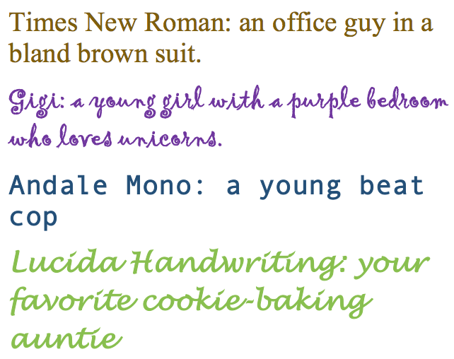
Who is your font?
My background in merging what I design with what I think the learner/user wants to engage with, definitely applies to the use of empathy in instructional design.
I confess to a mental shiver every time I work on a paper in APA style, as there’s nothing I like about Times New Roman. APA doesn’t insist on using that font (p. 228), but I’ve never had the courage to substitute a font my sensibilities prefer, like Caslon or Garamond.
Demonstrating empathy
One reading I found especially useful in exploring empathy overall, and in regard to my interpretation, is the study by Vann (2017) that sought to answer how instructional designers describe demonstrating empathy when making instructional strategy decisions. The study, based on interviews with experienced instructional designers producing content for adult learners in higher educational settings, yielded six themes (p. 236).
These six themes include the following:
- Criticality/importance of empathy in instructional design
- Instructional strategies that should reflect empathy
- Knowledge of the audience/learners
- Hindrances to demonstrations of empathy vary
- The understanding that online learning requires different considerations
- Relevancy.
Describing and exploring empathetic experiences
I found it useful to understand and apply Vann’s (2017) findings from my personal experience.
Criticality/importance of empathy in instructional design: Perhaps even more important that other design or programming skills, an instructional designer must have an understanding of the learner/user experience and their motivations for participating in the learning activity.
Instructional strategies that should reflect empathy: Following from the first point, factors identified as important to empathize with the user must be incorporated. This was a complex lesson for me to learn. I have developed content that may be provided to different user groups, each having different needs and requirements. So, for example, in a two-hour lesson as part of a longer course, I may take a paragraph or two to set up a scenario for a project plan. If I was producing an infographic on a technique, the user wants just the facts, without embellishment or scenarios. If I was producing a blog post for a commercial site, it may be a combination of those factors—from a marcomm perspective, the post starts with a very short scenario to pique the reader’s interest before evolving into an examination of a technique or application of some software process that solves the scenario’s issue or problem.
Knowledge of the audience/learners: I am fortunate in that in most cases where I have developed learning content, I have been supported by a veritable army of marketing and communications experts who provide everything from A/B Testing of font schemes for a particular audience, to the optimal Flesch Reading Ease value for a paragraph in an online lesson. I’ve also been privy to a great deal of marketing data that identifies user characteristics in fine detail.
Hindrances to demonstrations of empathy vary: Vann (2017) identified several topics relating to this theme, such as instructors lacking empathy or policies. Fortunately, I haven’t had experiences where that has been the case, as I facilitate the online course content I produce. The restrictions imposed on the production of any type of content I’ve developed haven’t precluded me from considering the users’ needs.
The understanding that online learning requires different considerations: This theme is highly significant to my point of view. Again, assuming the role of the learner, how would you want to be presented what you needed to learn? Of course, you’d prefer it to be interesting, provide enough information for you to succeed without undue frustration, and that it not be too advanced to understand with careful consideration. One thing I’ve learned is the value of consistency, which always helps the learner/user orient themselves to the content.
Relevancy: I carefully consider the relevancy of the content I produce for my online graphic design courses. As I develop the content, I think of it from the perspective of a budding designer, and what they would need to know to produce some specific outcome. The courses are sometimes part of a larger diploma program, and I also consider what my components of the program will contribute to the students’ overall learning.
References
Vann, L. S. (2017). Demonstrating empathy: A phenomenological study of instructional designers making instructional strategy decisions for adult learners. International Journal Of Teaching & Learning In Higher Education, 29(2), 233-244.
American Psychological Association. (2013). Publication manual of the American Psychological Association, 6th Edition. Washington, D.C.: American Psychological Association.
December 3, 2017
Okay, I’m loving the title – “Times New Roman is a guy in a brown suit” and I’m curious to engage with you more about fleshing out the metaphor … I feel like this is only the start of an interesting conversation!
December 4, 2017
Yes, I had to smile when I was preparing the post. My goal was to teach my learners the value of taking the time to examine their clients’ needs carefully, and I admit the “guy in the brown suit” was a bit of a hook, as it’s an unforgettable description of something so utilitarian as the most utilitarian of all fonts. But it served its purpose, and I daresay played a role in the development of some good designers. Taking the analogy further, I always thought that Times New Roman was a guy in a brown suit, not very fashionable, with a boxy leather briefcase who was likely a lower- to mid-level insurance executive. Designing with that font (and anthropomorphized description) in mind, leads to a fairly utilitarian, basic design, in keeping with the design sensibilities of said Mr. TN Roman.
December 24, 2017
I’m still laughing at the title.