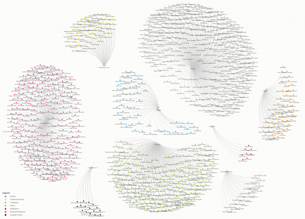
The graphic above is a visualization of my personal network. It’s a relatively simple visualization and doesn’t represent the interconnectedness of these various networks. In order to keep the time associated with developing this graphic manageable, each connection is limited to a single type. In reality however, the majority of these individuals would fall into several categories and there is a significant amount of overlap in their connections. However, I do like the way this is represented, to show the networked resources at my disposal, depending on the need at any given time.
It’s a fairly large group of people, representing an immense wealth of knowledge and experience. As I’ve mentioned on this platform before, I haven’t spent much time or energy leveraging this network or being an active contributor to the pool of knowledge, but I look to change that in the near future. Over my time in the learning and technology program at Royal Roads University, I’ve developed a self directed approach to learning. This acquisition of meta-learning is what Anderson and Dron (2014) observed as an essential skill for networked learning. As I continue to learn on my own, post-graduation, in an ill-structured environment, it will fall to me to cut through the significant noise online to pursue truth.
I look forward to the experience, and hope to bring you with me!
Reference
Anderson, T., & Dron, J. (2014). Teaching Crowds: Learning and Social Media. In Teaching Crowds: Learning and Social Media. Athabasca University Press. https://doi.org/10.15215/aupress/9781927356807.01
Wow Chris! Your map is incredible! I did not put that much detail into my map. I would love to know, how you were able to pull all of those names together? Did you have to do it one by one, or is there a trick to that?
Thanks so much, Giulia! You’re very kind to say that. There was indeed a trick! I did a little research and learned that you can export your Facebook and LinkedIn connections. Facebook exports as an HTML file while LinkedIn exports as an Excel document. The tool I used to build this was one that Russ recommended, called https://kumu.io/. The platform allows you to import Excel or CSV files that can be used to build a visualization of connections.
I had to copy the content from Facebook HTML file into an Excel document to get all of my exported contacts into one place. Then came the somewhat tedious task of labeling each entry into a category that represented the primary way in which I was connected with that person. Once that was done, it was simple to import the file into Kumu and build this representation.
As I mentioned in the post… the connections represented here are pretty simple. If I had more time I could include additional secondary and tertiary categories to show the greater interconnectedness of the network… but alas… time wasn’t on my side. As you know, we also have other projects we have to work on.
Thanks again for taking the time to comment. Much appreciated!
I echo Giulia’s comment of–WOW! It is pretty incredible when you map out your personal network, although I can safely say mine would not be as ‘full’ as yours!
You have a category titled “Extended Network”; who does that refer to?
I am also curious about your colleague/student categories: do these refer to current people, past, or both?
Thanks!
Thanks for taking the time to give my graphic a look Terry. I could have been more descriptive about the categories in the post, so I appreciate you encouraging me to elaborate on that subject.
I’ve spent much of my professional career in media and marketing, and in that field, people tend to reach out to connect and communicate. The “extended network”, I’m not super proud to admit, is the list of people I have connections with that I don’t recognize. I don’t doubt that at the time of our connection, the interaction made sense, but we probably haven’t communicated since that time. What’s interesting, however, is that this is by far the most diverse group, representing a wide range of specializations. A very interesting group of people.
The “colleague” and “student” categories are a mix of current and past relationships. Well.. to be fair… I’m not actually teaching right now, so the student group actually represents only those people I’ve taught in the past. The colleague group represents those people I’ve either worked with in the past, or am currently.
As you say… over twenty odd years of working… the list got pretty long. What was interesting was to go through the list, which were originally sorted by the date we connected… so it was kind of a travel back in time to different periods of my life. A little walk down memory lane. I was surprised by the name of the first person I connected with on both Facebook and LinkedIn… not who I was expecting!
WOW, Chris!! Your map looks impressive. You mentioned that “the connection represented here are pretty simple” I don’t see anything simple about your map 🙂 I wish I were able to click on it to see it more in detail.
Hi Michal! You’re so kind… but honestly, it’s not as complex as it appears at first glance. I think if you were able to blow it up, you wouldn’t learn much more. It really is only a very long list of names, separated into a series of categories. As I was saying in response to Giulia’s comment, if I had more time, I would have entered more data to show additional connections, which would have resulted in a much more interesting graphic. Many of the people represented in this graphic were previous co-workers, who became friends, who became like family. Students who have become clients… others who have become close friends… family who have become academic contacts… and so on. So, in that way… the visualization is fairly simple. I actually enjoyed the process of putting this together, so may elaborate on it further when time allows.
Hi Christopher,
Wow, that is quite a personal network. Did it surprise you at all to see it visualized this way? It makes me wonder what mine would look like if I took it to the individual level that you did. I was wondering what your process was and if you had all those names filed in your brain… but then I saw Giulia’s comment and your answer 🙂
I am wondering how you plan to be a more active contributor to knowledge within your network as you have referenced in your post?
Hi Leah! Did it surprise me? Yes and no… I was indeed expecting it to be quite large, but it is a little striking to see it like this. I think I was most surprised by the size of the student and extended network categories. It’s pretty common for a student to connect with me during a class or immediately afterward… and I get approached by people out of the blue from time to time… but I don’t really think about it much. So, over years, these numbers really start to add up without me being aware of it. It’s a little strange to see it all in one place.
Again, I apologize for my brevity in the writing of the post. I was pressed for time. I’ve explained this in other posts, but should not have assumed that the reader of this post will have read others. My plan after graduation is to continuing blogging. I’ve enjoyed blogging throughout the program and it will force me to keep up to date with current research, where otherwise I might not. I’ve already found myself a new URL and my understanding is that RRU will provide the content from this page as an export following graduation upon request, so I shouldn’t have to start from scratch.
Thanks so much for taking the time to check out my post!
Great work, Christopher!
I’m fascinated by how many of your clusters actually look a little like brains. And that’s actually a fun way to consider how our different networks often function for us… as specialized “hive minds” that embody knowledge and experiences in particular areas.
I am curious about where you are situated in relation to all of these clusters? What “types” did you use to categorize your network contacts?
And thanks for the reminder about “ill-structured environments,” which can be something that I struggle with at times. I like order. Systems. Structure. They are things that as a designer, I have been taught to try to cut through in order to seek (or build) clarity. Sometimes it’s good to embrace the messiness of life, and let the patterns reveal themselves.
Huh… that’s an interesting observation. It hadn’t occurred to me that they look like brains… but now that you point it out, I definitely see it. That’s actually a really great analogy for what these networks represent.
Where am I in the image? I suppose If I included myself in the visualization, I would be a single point in all of the clusters… not a particularly interesting or significant point… but definitely a member of each group. This is even true for the “Student” category, I think. While I was technically in a position of authority in association with that particular group, I definitely learned from each of the individuals represented there in some form or another… so in that way, I too was a student.
The categories are a little difficult to read, due to the resolution of the image… but the types included… Family, Childhood Friend, Colleague, Client, Neighbour, Extended Network, and College Friend.