Map of My Technology Use
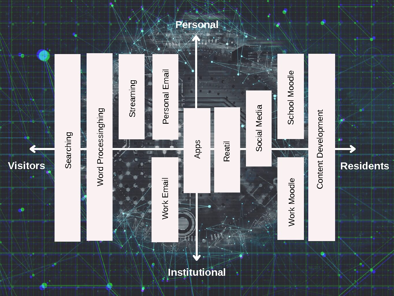
This map of my technology use follows White (2013) strategy for reflecting on the technologies Canva. White’s process asks that technologies are plotted on a graph. The x-axis marks where on the continuum the technology falls between “visitors” and “residents”. These terms are used by White to identify the degree to which our digital footprints remain after using the particular technology. The y-axis of the graph measures whether the technology is used in my personal or professional life. Together these present a visual of our technology.
For this process, I labeled the technology by its purpose and not by the specific tool or site. For example, I have a social media block. However, this block includes tools like Facebook, Snapchat, Discord, BaseCamp, Instagram, and Twitter. My reasoning for not identifying specific tools was that the specific tools I use change frequently. Additionally, I noticed that for most tools, I have separate accounts for my personal and professional tasks, except for social media. This is because I often use social media in my own time to follow trends and participate in informal conversations with fellow professionals.
White’s exercise in mapping our technology use is important in identifying how technologies are used personally and within an organization and reflecting on the footprint the use of each technology leaves behind.
References
White, D. (2013, September 13). Just the Mapping [Video]. Youtube. https://youtu.be/MSK1Iw1XtwQ

Recent Comments