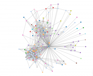
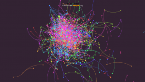
I decided to separate and investigate my networks into 2 different areas. I looked at LinkedIn as a professional network (using Socilab software to create my map) and decided to also look at Twitter (using Netlytic software to create my map), not at my connections directly, but to investigate the #edtech that I follow and to see who was networking using this hashtag.
For my LinkedIn map of my professional connections (I’m the blue dot in the middle where all the lines go to) I subdivided them into industry connections to see how varied my network is based on peoples employment. After looking it over it was pretty clear that I network the most with people in the education industry (light blue) and construction industry (purple). This makes perfect sense as these are the two biggest professional areas of my life past and present.
As mentioned above, I decided to follow the twitter hashtag edtech and see how many people were connecting using it. I really liked the Netlytic maps as the nodes got bigger as that person got more traffic, and although the overall map looked like a jumbled mess when you clicked on a node it isolated their direct connections and provided a list of users on the left hand side. I used a name network which tells us who mentions whom, rather than a chain network that shows who replies to whom, I thought this would give a better picture of who is in this network.
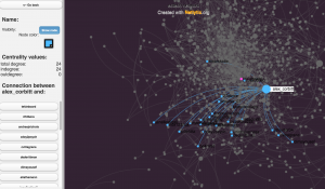 As you can see in the image above someone named alex_corbitt had 24 connections in this map.
I can imagine that this would be a very powerful research tool if used to find out what particular people are networking and what topics they are connecting about.