
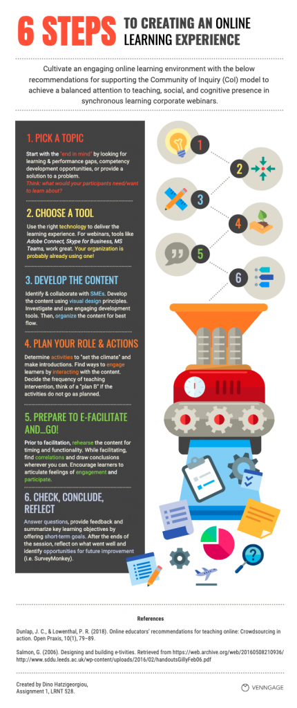
The purpose of the below infographic is to provide recommendations for achieving a balanced attention to the three presences of the Community of Inquiry model (Teaching, Social, Cognitive) in synchronous online learning environments within the corporate organization. For corporate synchronous learning (webinars) to be effective and engaging, a single topic may be delivered within a 45-60-minute session. Longer modules may necessitate multiple sessions to cover the subject matter, thus requiring additional resources and staff availability.
During an online educational experience, the CoI presences (Garrison, Anderson, & Archer, 2000) are converging as the discourse evolves. Therefore, both facilitator and participants experience the presences in a non-linear fashion with overlapping parts, such as content selection, setting the climate and supporting the discourse. More importantly, the steps outlined below are covering all CoI presences and are offering a recommended sequence for the design, development, implementation and learning evaluation of a short online synchronous session, such as a webinar.
Steps 1, 2 and 3 are focusing on the identification of the training need, content and technology selection, and content development to ensure that teaching presence is effective and allows content understanding while providing “hooks” for the discourse.
While developing the material, in Step 4, the facilitator designs e-tivities (Salmon, 2006) and icebreakers to set a climate where participants are feeling a sense of social presence within the virtual space and ensure understanding of the content.
In step 5, the instructor prepares to facilitate and tests the material for adequate timing and functionality. While facilitating, conversations can be dynamic and the frequency of the facilitator’s intervention can vary. Therefore, the facilitator should be ready to adapt the content as necessary depending on how the discourse is developing and whether there are (or not) signs of cognitive presence.
In step 6, the facilitator seeks to provide additional opportunities for content understanding by allowing students to ask questions or moderates the online chat (if available) for any items requiring attention. In addition, he/she summarizes key learning points and provides feedback as necessary.
Finally, before the end of the session, it is recommended that the facilitator administers a quick poll to measure pre and post-learning effectiveness. After the end of the session, an online survey can be distributed to collect feedback for improving the learning experience.
PDF of the infographic: Infographic_Assignment
References
Dunlap, J. C., & Lowenthal, P. R. (2018). Online educators’ recommendations for teaching online: Crowdsourcing in action. Open Praxis, 10(1), 79–89.
Salmon, G. (2006). Designing and building e-tivities. Retrieved from https://web.archive.org/web/20160508210936/http://www.sddu.leeds.ac.uk/wp-content/uploads/2016/02/handoutsGillyFeb06.pdf
September 15, 2019 at 10:24 pm
Hi Dino,
I just wanted to leave a quick comment. Your infographic is beautifully designed and easy to follow. After reading about your context I feel like creating a CoI would be a challenge to implement in the 45-60 minutes of the webinar time. I like how you were able to adapt the concepts of social, cognitive and teaching presence to your situation. Are the learners in your context moving through a series of webinars as a co-hort? Are they able to build a community that way? If you have a constantly changing group of learners that are only together for 45-60 minutes do you feel like a CoI is possible? I was wondering if you had tried this and if so, was it effective? Thank you for sharing your infographic. I think it would be an effective tool for many contexts.
September 18, 2019 at 8:39 pm
Thank you for your feedback, Tanya. In a corporate environment, and depending on the size of the organization, it’s not unusual that employees may know the trainer and each other. It is true that short webinars are challenging for creating a true CoI. So, what I envisioned and depicted in my infographic was my experience in attending engaging webinars, running myself presentations online and engaging participants, as well as my effort in blending or squeezing-in the readings of this course. To your point, if you have a constantly changing group, you can only engage them through their goals for attending the webinar and pulling information from your audience. As for your last question, in my current role, we only offer f2f and asynchronous eLearning modules and some blend of both. I do have a few ideas for moving some f2f classes that do not require participants’ physical presence to a distance learning/webinar-type format but I don’t think that the culture currently supports it.
September 16, 2019 at 9:39 pm
Dino – I quite appreciated the format (6 steps), the structure, the tool suggestions, and the friendly language of your infographic to help trainers/instructional designers in a corporate environment (or anywhere). With the structure, the colours, and the icons/illustrations you already balanced my cognitive load and pulled my attention to the essential steps, practical suggestions and considerations. I wonder if in some way showing which tip/suggestion belongs to which presence (social, teaching, cognitive) would make the infographic even more informative for you and your colleagues. – Beata
September 17, 2019 at 8:49 pm
Beata – much appreciate your feedback and idea for defining in the infographic what steps map to the CoI presences. The content of the blogpost actually identifies how the steps reflect to the presences of the CoI in addition to stating that the presences overlap as the discourse evolves. You’re making a good observation, however, it would make the infographic too busy and possibly “messy”. My main objective was to depict the flow for the design of the learning experience as it relates to the CoI, taking under consideration that the audience reading the blogpost would already be familiar with the CoI and would have read the narrative. If you have a “clean” way of adding your suggestion to my infographic, I would love to see how you have thought of the combination working visually.
September 17, 2019 at 10:26 pm
You are quite right, Dino – the accompanying post provides info and makes the infographic a whole. I teach web development and design; thus, I am always considering that an image can show up independently in a web search without the post; thus, it is always suggested to ensure the illustrations can stand individually (if they are not just for illustration). Thank you for asking for my suggestions, Dino. From the design point of view, they are the following: Use one accent colour for the numbered headings to highlight them. The numbers already link them with the additional illustration no need for the various different colours (though they looked excellent). This ensures that your design will not get messy/crowded. Use three colours for the different presences and colour code the various suggestions. With this, you provide useful information in the infographic itself. From user experience (UX design) point of view, I encourage everybody to design around the content and not place the content into an existing design.
September 16, 2019 at 11:02 pm
Dino, what a beautiful infographic, it is detailed and clearly lays out the plan for facilitators. I was curious about the flow of your steps. They all make sense and take steps to achieve the end goal of learning and creating a positive environment. I wonder if you had thought about allowing the path to take a different route? Could the flow be circular or have arrows to move about? For example, what would happen if your facilitator decided to try a new tool first or asked the students for feedback on a scenario first to get started on a topic? Do you see this working in your context? Danielle
September 17, 2019 at 7:56 pm
Danielle – Thank you for your comment and for sharing your ideas and suggestions. If I understood correctly, you are suggesting a circular flow, and in particular, trying a new tool while facilitating (step 5) and possibly feed the outcome to step 2. It’s an interesting thought and I suppose it depends on how much tolerance to risk-taking the environment allows and whether the facilitator/or the trainees (under guidance from the instructor) is willing to try to implement something untested. As it was mentioned in the blogpost and the infographic, the steps constitute of a recommendation, rather than a go-to model. In my experience with either systems design or design thinking models, the design of the solution and selection of the tools/technology takes place during the design and development phases (systems design) or during the ideation, prototype phases (design thinking). In both models, testing is taking place before implementation and in my infographic, testing is suggested in step 5. As for your question whether your suggestion would work in my environment, I would say “negative”. As the manager of the training design function, I wouldn’t take the risk because it (a) might jeopardize the learning experience, (b) could risk the successful achievement of the learning outcomes, and (c) would be contrary to the systematic design approach we’re committed to employing for regulatory compliance reasons.