

Image by Kevin Dooley on Flickr CC2.0
View full-size at flourish.studio ⤤
In this exercise, the goal is to visualize our network, that identifies where we are, and how we are situated. After trying several data visualization tools and charting strategies, I opted for a chart showing a hierarchy of organization and role, displayed as a radial chart. These are all first-degree connections, with myself positioned at the central axis of the network. This represents a first-person view outward at my connections in a community of learning professionals.
Data source
The first task was to determine what the source would be for mapping my learning network. In examining the online networks already mapped out in my Digital Identity and Presence analysis, it seemed the most logical network to investigate further would be my LinkedIn connections.
My 538 first-degree connections on LinkedIn span several career phases, and connections across my design, consulting, and education activities. I narrowed this down to 61 connections, who either work directly in primary, secondary, or post-secondary education in some capacity, or have a learning role in an organization where learning is a growth and development function, not a primary offering.
Onto that, I also mapped my new MALAT cohort contacts.
I categorized each individual by title/role, and their organization, removing individual names from the map, as I felt they were not necessary level of detail for how I wanted to visualize and map out the data.
Data Organization Strategy
The raw data export from LinkedIn was more limited than I anticipated, and the only fields available were name, title, organization, and the date connected. Shared contacts, shared past employers, education history, and other common touchpoints were not a part of the data export, which meant I had to consider the narrative I was able to build from the available data, without going through a time-consuming process to manually reconstruct more elaborate data linkages for all these contacts.
This seemed like a good opportunity to apply Richard Saul Wurman’s LATCH organization principle. (Wurman, 1997) In his pioneering work, Wurman suggests that there are five primary ways to organize information: by Location, Alphabet, Time, Category, and Hierarchy. These principles may be used alone or in combination to organize information for understanding.
For the purposes of this exercise, and the data available to me, I opted to use Hierarchy and Category. Secondary sorting is also alphabetical, for no other reason than to give the reader a frame of reference for how the data was configured.
I decided to first link my connections to their employer/institution/organization. By doing this, I could then see where in my network my connections were concentrated, and then who works where, and what their job titles/roles are.
The additional layer I added into the data hierarchy was also identifying those in my network who are in my RRU-MALAT cohort, as well as my professors who are now LinkedIn connections. This was interesting, as it also showed the people in my network who are in the Master of Arts – Learning and Technology program, but may not necessarily have “learning” or some other obvious education-derived title.
Because this information map would also appear on a publicly-accessible blog post, I also made it a priority to anonymize the data, as there was not sufficient time to secure consent from all parties.
Visualization Approach
I explored several different data visualization tools, starting with Microsoft Excel and Google Sheets. These seemed somewhat lacking in their affordances for mapping out more complex data networks.
Next, I explored the possibility of using NodeXL, or Kumu, as suggested in the activity brief. NodeXL is a Windows-only plug-in for Microsoft Excel, which was unfortunately eliminated for me as a Mac user. I tried out Kumu, which seemed to have great potential, but I was not able to get my data formatted in a way that produced a coherent map. I also tried an open-source app called Cytoscape, which proved to be somewhat confounding to use. The last avenue I explored was Flourish, which has a wide array of visualization options, and I was able to get my data to work.
Since my data set did not include interconnections and mutual links between my contacts, I found most “network map” charting topologies didn’t give me acceptable results. Going through my curated contacts and adding all of the mutual connections may have added some additional detail, but the manual process of going through all 61 connections would have taken additional time.
The “Hierarchy” maps offered by Flourish presented some interesting potential. Because I wanted to show organization and then job title/role groupings, three options seemed like good candidates, Radial, Circles, and Sunburst.
Radial
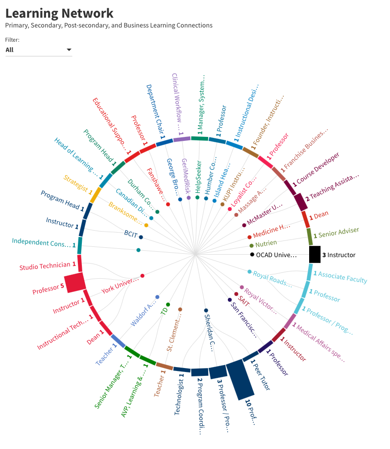
The Radial chart type was promising, in that it showed a web-like linking pattern from the central focal area (which represents the author), but many organization names were truncated, and was also very text-heavy and not particularly visual.
Since the goal was to design for understanding, this chart type seemed lacking.
One feature of Flourish that was very easy to use was the ability to format data groupings using custom colour palettes. Most of the major organizations in the chart are identified using their actual brand colours.
Circles
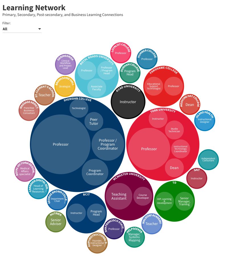
The Circles chart type was getting more promising, with much greater visual presence and impact.
However, two things about this chart did not sit right with me:
First, it placed even greater importance on the organizations with more connections, and although the size dominance is an inherent part of the hierarchical nature of the chart, the relegation of smaller organizations to the periphery seemed like it was minimizing their presence a bit too much.
Second, the central connection between all of these organizations was not entirely clear. They seemed to be drawn together merely by force of gravity, rather than arranged around a central focal point, which is me, sitting at the “hub” of my network.
Sunburst
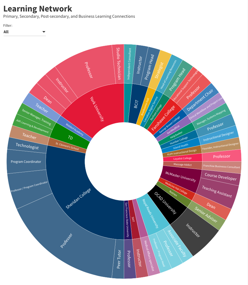
The Sunburst chart seemed like the best balance of features and functionality to make my learning network most easily seen and understood.
The inner ring is the organizations, arranged alphabetically, clockwise, starting at the top, with the size of each circle segment proportional to the number of individuals in my network who are in a learning role, a MALAT student, faculty member, or alumni. Principal brand colour for the organization is used to colour-code them.
Clicking an organization name brings up a detailed view of the breakdown of the number of individuals with each title/role.
Applying a filter also enables the viewer to see MALAT Students, Faculty, and Alumni.
(One unfortunate limitation is that only one column of data could be used for the filtering, so although one faculty member is also an alumnus, the ability to show that contact in both Faculty and Alumni categories was limited by the software.)
Conclusion
I could go into a great deal more detail with the mapping exercise, and may still explore this concept further, building out a more robust data set, and tinkering with the interface to reveal even more insights about the nature of my network(s).
Given the time constraints, new tools, and limited data set available to me, I feel this does do a good job in representing my learning network as a hierarchy. With more time available to invest, I would be very interested in mapping out a much more layered and interconnected (and possibly three-dimensional) map that would be perhaps even closer to the model I see in my head.




Exceptional job on your visual networking map Darren! I enjoyed exploring your different networks and appreciate your creativity in the way you designed your maps.
Thank you, Giulia! I had the good fortune to have just wrapped up teaching a course called Information Design for Understanding, where we taught some of these same principles of gathering, analyzing, and organizing data, then choosing the most appropriate way of turning data into a meaningful visualization. It was really interesting to dig into the process with my own data set and figure out how to bring it to life, and what narrative could be revealed. Information design is fascinating, and I love the potential to reveal interesting stories through interactive data visualization.
I was a little disappointed with how thin the data was from my LinkedIn export. To reconstruct the full complexity of my learning network would have taken many hours of manual data entry to document all of the mutual connections and more nuanced linking. LinkedIn used to have some great tools of their own, but I suspect that data privacy regulations (and lawsuits) have put an end to a lot of that in a post-Cambridge-Analytica world.
Darren, I appreciate your approach to using many forms to represent networks, groups and sets. I was keen to try NodeXL and Kumu but couldn’t complete an image within the time I had in my schedule. I thought that the Flourish circle would work to illustrate groups and sets, but I see the challenge in representation. I’m working on my map now (I’m late). Thank you for the inspiration.
I am thinking about the purpose of making the map. Did you interpret the assignment as a process drawing to clarify your thinking? Or as a graphic communication tool to illustrate your network to an audience? Maybe both?
Thanks, Jessica. It was (and continues to be) a work in progress. Like you, I really struggled to get Kumu to do what I wanted. No matter which way I set up the dependencies, the columns of data just didn’t produce anything that remotely resembled a “map”… just a field of circles. It took me several tries with various tools before I landed on Flourish.
The circle chart on Flourish is a really good visualization. I still flip back and forth between them. I think what tipped it more toward the sunburst for me is that I saw the chart as a visualization from my point of view at the “hub” of my network, and the radial nature of the sunburst seemed to better fit that point of view for the narrative I was trying to build.
The purpose of the map is a really good goal to keep in mind. What data are you trying to show? Who is your audience? What narrative(s) can be revealed through the data and the relationships you are able to show? For me, it was a way to try and visualize how I view a certain subset of my LinkedIn network, who are all connected in some way through learning. I think that’s what a network is… a group of individuals linked through a common purpose, goals, activities, and/or organization.
While I don’t think my network map in its current iteration is entirely complete, I think it’s a good first run at showing some of the connections in a way that makes sense to me (and hopefully my audience of MALAT colleagues).
Hi Darren,
I enjoyed reading through the process you took to come up with your visual network map – the end result was very visually appealing. I am fairly new to these types of tools so I would have gained a lot from your post if I had read it before doing mine. I will check out Flourish for future use. I noticed that you have mapped your learning network specifically. I am wondering what you used to determine the criteria of what would constitute a “learning” connection?
Thank you, Leah!
I’m glad you found the process helpful (or at least enjoyable). I am very process-driven… to me, that’s what design is, more than the end result. And how it functions as a piece of communication is at least as important to me as how it looks.
My choice to map out a “learning” network was a way to try and keep it relevant and focused for the intended audience – the community of learning we are building with our cohort and faculty members. My decision to start with my LinkedIn network was somewhat arbitrary, as I assumed it would be a fairly good place to start with the various connections I have across many different organizations.
I have connections who work in education at all levels, and many who also work in learning roles in business. I included not only those involved with direct delivery of learning (teachers, instructors, professors, etc.) but also technicians, instructional designers, administrators, and strategists, as they are all equally important members of the learning community.
What was really interesting was including my MALAT connections and seeing that many people’s role, title, or job description does not necessarily include the words “learning” or “training” or “education” and that learning may be just one part of a much more complex role. So that in itself was an interesting exercise.
The data from LinkedIn was also surprisingly (and frustratingly) incomplete. I thought I was going to get a really robust and detailed picture of my network, but the data was thinner and flatter than I expected. But once I started working with it, I decided just to keep going, even though it presented some limitations. If I had the time, I’d go back through my connections and build out a much more detailed data set to work with, which might open up more possibilities for how to visualize it.