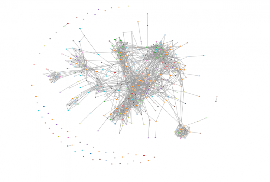
This map shows the connections I have through LinkedIn and is an interesting view of how I am personally or professionally connected to others within this digital community.
Looking at this visualization and what it represents, it was interesting to see that each cluster of data seemed to fit around a different path that I had taken in my career. Journalism, marketing and education all make up different clusters with interesting connections among them.
Friends and family who have connected with me on LinkedIn seem to meld within the different clusters and don’t necessarily have a specific place within the connections. This seemingly random placement was interesting to see, including all the different industries I am connected to through that community.
Even more interesting was the outliers who seem to float without a connection to any of my connections and live in the outskirts of the map.
This map was made using Socilab.
Tutterow, C. (n.d.). Retrieved from http://socilab.com/
Leave a Reply