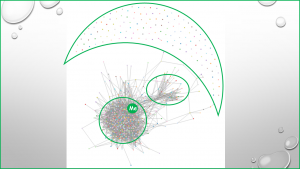
Having a graphic view of one’s contacts network gives quite a different perspective than just the list of names, and the colouring criteria chosen to look at the network provides diverse angles from which to look at it. Very interesting. The map shown depicts how my contacts are clustered, and on the resulting map there is a very dense cluster in a circle that represents contacts that are work-related. There is also a much less dense cluster in an oval which contains mostly family-related contacts. There are also scattered nodes that are away from the clusters, and with few connections. Lastly, there are several contacts within the waning-moon-shape area that do not show any contact lines. These are people that accepted the invite to be in my network but they have not developed theirs. It will be interesting to note if there is any change regarding these lonely nodes when they discover some activity on my part once I start posting and having more information in my LinkedIn web-space. Who knows? I may trigger them into action.
Reference: Tutterow, C., (2013). Map generated using open-source software retrieved from www.socilab.com