After 5 tries with the Socilab network mapping tool, I finally got a look at how my LinkedIn network looks from a visual perspective. I have to say, it does represent a lot about me. A quote from Jon Dron and Terry Anderson’s book on Teaching Crowds comes to mind immediately.
“People may drift in and out of network activity and participation based on relevance, time availability, context, needs, and other personal constraints” (Dron and Anderson, 2014, p.76).
Context in particular holds relevance to me.
In my life, I’ve traveled a fair amount, and I’ve made connections everywhere I’ve gone. Many of these smaller networks have no link to others, with me being the only node to connect them. This has meant that when I move somewhere new (and am planning to do so again in the next few months), I have very little network at the start. When I look at the below map, there are clusters that represent different stages and groups in my life, with many not knowing or being connecting to each other.
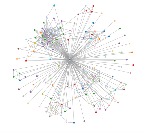
When I reflect on how this has affected my professional life, it does remind me that the act of establishing myself in new physical communities has not really been aided much by my virtual connections. I am hopeful that through my renewed dedication to cultivating the online ‘me’, that I can create networks that branch off of others, in order to open up more doors for myself. For example, I can connect with friends from my past who live in Guelph (where I plan to move), and through them I may find people in their networks to connect with my own. I want to hit the ground running this time, and establishing connections with a professional network through my personal connections can help me to ‘present’ myself ahead of time.
Notes on what the clusters and colours mean:
Clusters:
The largest cluster on the top left – my connections through my current job
The offshoot to the right of it (10 people) – a previous teaching job where I still substitute
The small offshoot at the top with three red — TechStart programmer students I taught recently
The main cluster at about 5:00 – my family and friend connections in Vancouver
The cluster at about 7:00 – my family and friend connections from where I grew up
Colours:
red – IT and computer related jobs
purple/light blue – education
orange – finance
green – management
Reference
Dron, J, & Anderson, T. (2014). Teaching Crowds. Athabasca University Press.
June 10, 2017 at 8:03 am
I had no idea what the colors meant. Thanks! Going to copy paste that to the comments on my connections map.